New Year, New Logo
Same Solid Answers
Lord willing, 2016 looks to be a big year of ministry at Answers in Genesis. We have the life-size Ark coming, the Renew-A-Thon family conference, a new Vacation Bible School (VBS) program, the Answers Bible Curriculum, and much more! In preparation for all of this, we tackled a big challenge: our branding.
More Than Aesthetics
A logo is at the core of who we are and what we communicate. At Answers in Genesis we talk often about the importance of “the message.” When someone first sees the logo, we want the person to engage with the truth of God’s Word, the authority of it, and ultimately the gospel.
The Challenge
In preparation for this big year we analyzed our brand architecture (fancy name for our logos and how they relate). We found that we were in a pretty good place. But we knew we could do better. We use the word Answers . . . a lot! We decided to take our branding to the next level by making the use of that word more visually consistent than previously.

The Answer to Answers
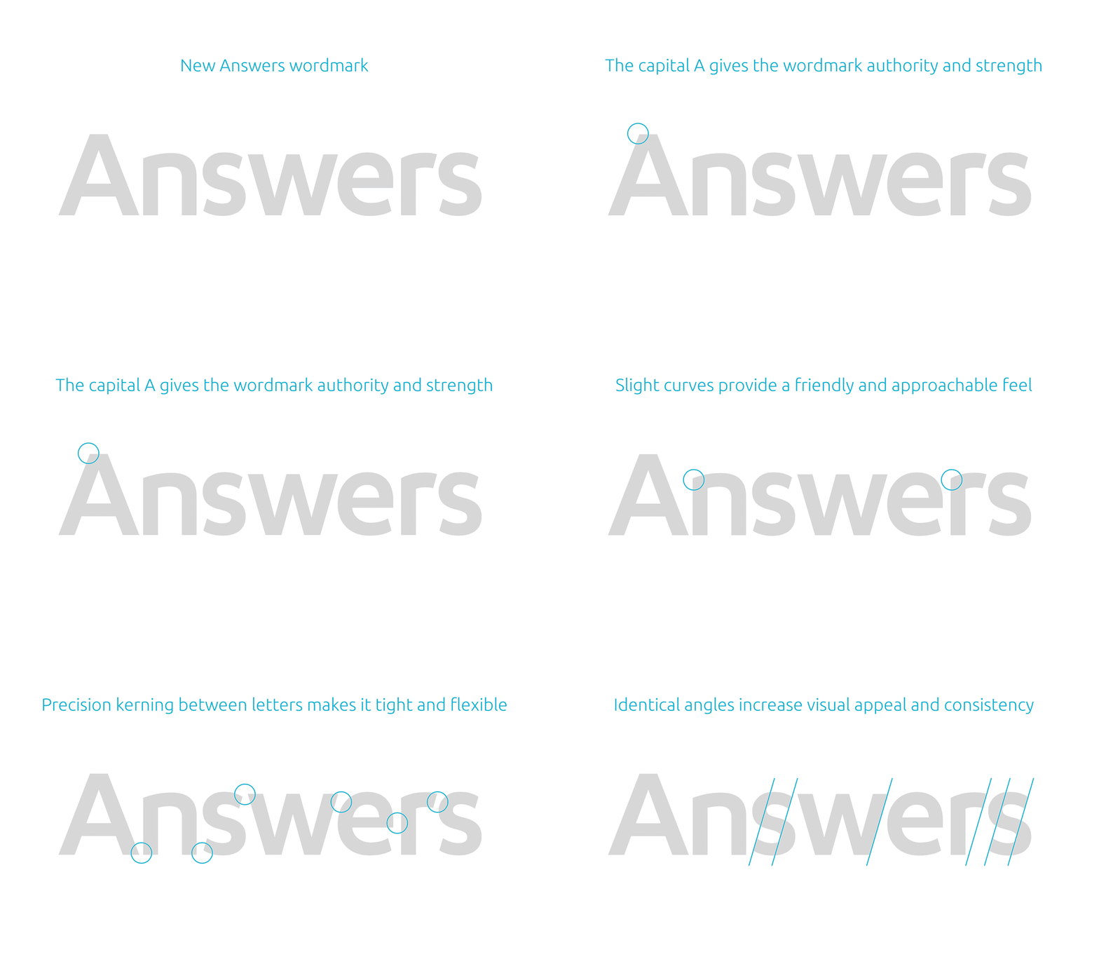
For the consistent Answers treatment, we combined two different fonts to create something new. It needed to be both contemporary and playful, authoritative but personal. We invested much attention to detail to make this as professional and beautiful as possible.

Evolution of an Icon
We then shifted our focus to the icon. The old icon communicated several things well:
- The talk bubble emphasizes the word: the words we speak, but more importantly God’s Word that we boldly proclaim. It also conveyed the idea that we want to start conversations about God’s Word.
- The “1:1” signified the foundational verse, “in the beginning,” of the foundational book of the Bible. And it obviously connects with the word Genesis in our name.
- The color blue signifies trust, loyalty, wisdom, confidence, intelligence, faith, and truth.
We wanted to keep these meaningful parts of the logo, but update it and see if there was anything we could add. We discovered that we could layer in a second meaning to the icon.

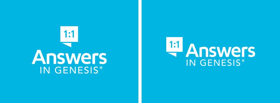
The new icon doesn’t have the dated round corners. This change makes it more geometric and timeless. The “1:1” has been updated to fit the new typography of Answers. But best of all, the icon now represents the greatest book ever written. The icon is now both a talk bubble and a visual representation of the Word of God.

Bringing It Together
To finish it off we combined the icon with Answers and added In Genesis to complete the new logo.

The word Answers now becomes the most prominent part of the logo. But it rests on the foundation of In Genesis communicating that Answers is grounded and supported by the Word of God. The two versions make it very flexible to use in any circumstance.
The logo being a single color also increases the flexibility. It allows the logo to be easily reversed out on solid colors or even photos.


More to Come
This new logo helps to better proclaim the message of Answers in Genesis. You will see it often as you visit our website, read our newsletters, and check out our resources. As you see it, please be reminded of the importance of the authority of God’s Word in every area of our lives. And please pray with us that in 2016 we would proclaim God’s Word more boldly and effectively than ever!
Recommended Resources

Answers in Genesis is an apologetics ministry, dedicated to helping Christians defend their faith and proclaim the good news of Jesus Christ.
- Customer Service 800.778.3390
- Available Monday–Friday | 9 AM–5 PM ET
- © 2026 Answers in Genesis


